
Drawing Sticks & Value

Last month I shared two posts about becoming acquainted with a new material, in my case: oil pastels (here and here). If the new material is any kind of drawing stick – a dry material that comes in distinct colors that are not easily mixed – it's important to get oriented with the values of those colors.
We went in depth on this approach in last month's EDI Live, but I wanted to post a cliff notes version here for everyone, and as a reference to come back to. (Our next EDI Live class in tomorrow! Hope to see you there.)
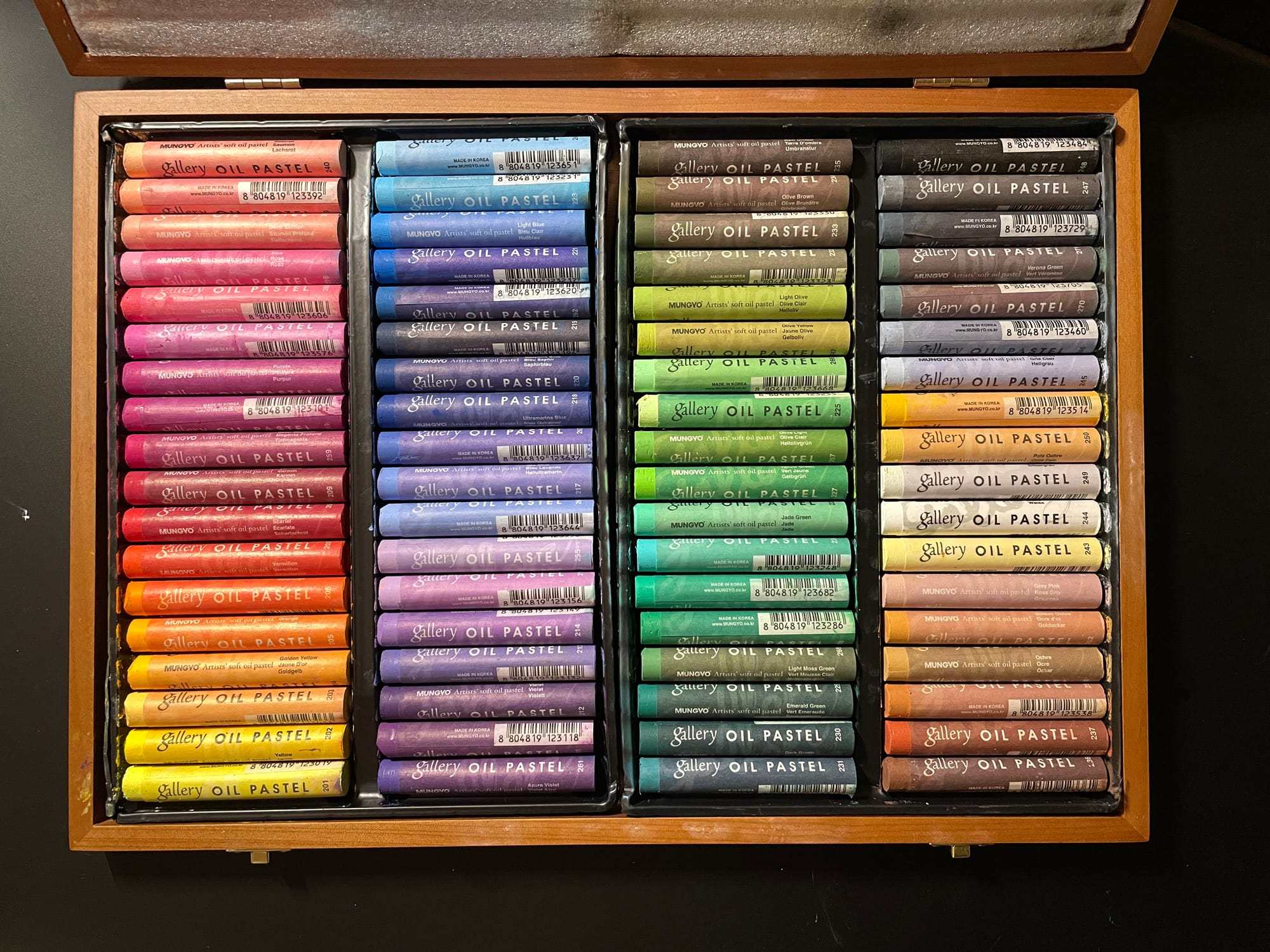
Here's how my new set of 72 oil pastels came. They are arranged in a rainbow pattern starting with yellow and going to greens, which then roll into darks and a spectrum of neutrals.
The colors are so vibrant and saturated that at a glance I have a hard time identifying how dark or light the colors are. Have a look at the set in black and white. (To do this, take a photo without any kind of filter and then use an editing app to drop the saturation to zero. This will give you an accurate value read, while the various preset black and white filters that come in our phones will shift the values a bit.)
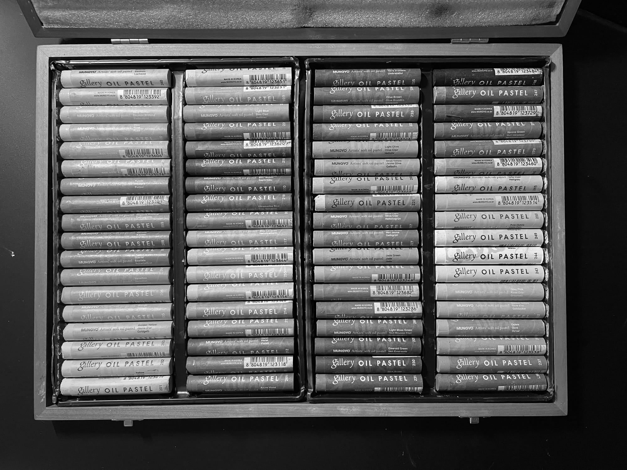
We can see that there are a lot of mid-values in this set, and that some very rich colors (like the reds in the middle of the far left column) are actually fairly light/mid compared, for example, to the greens in the bottom of the third column from the left.
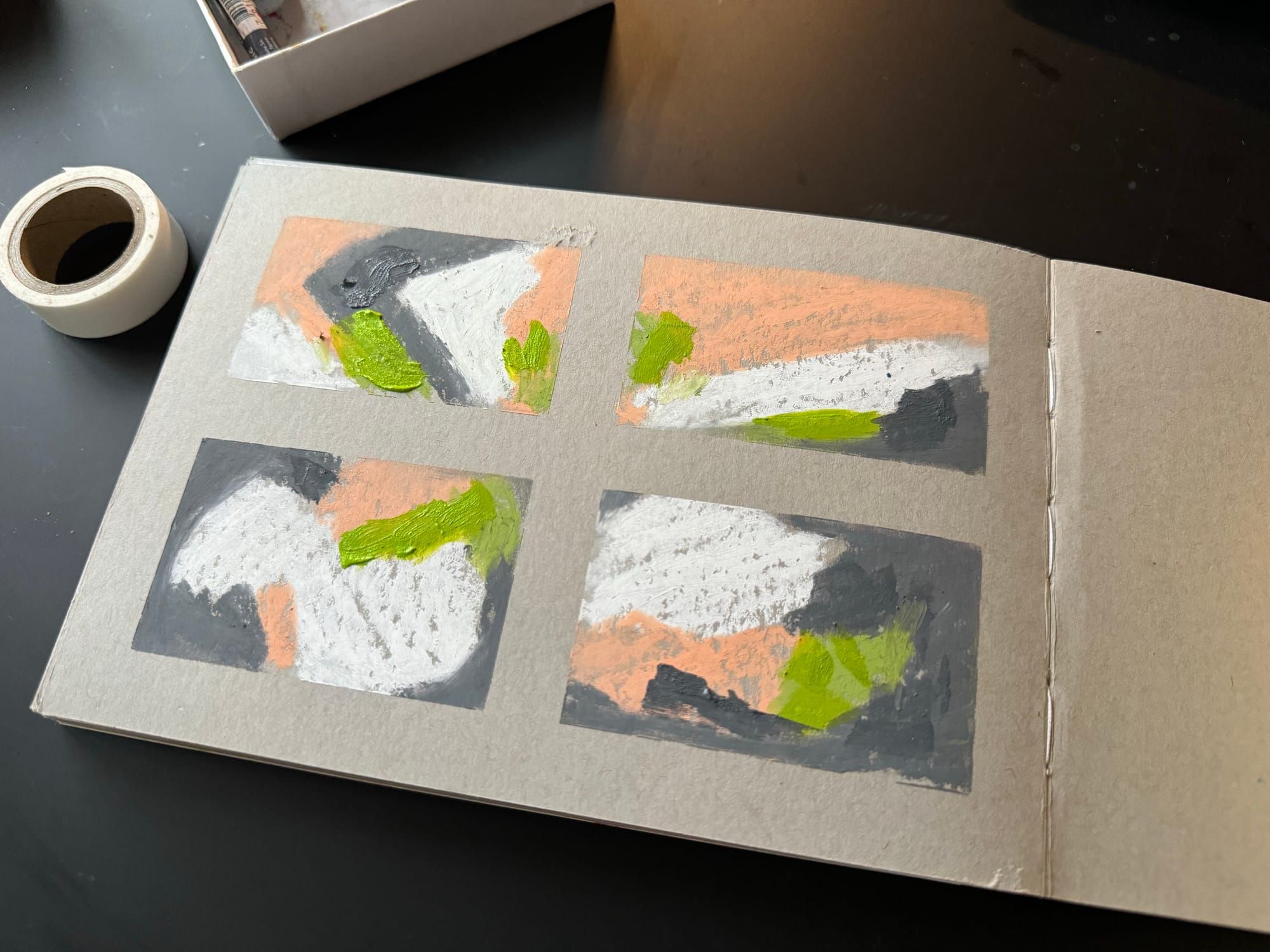
An even better way to get a handle on this is to swatch out the all the colors in the set, take a photo and set it to black and white. I did this below with some pretty haphazard swatching. If you compared the top thirds of the page below you can see that equally bold colors actually have a significant range in value.