
Limited palettes
Earlier this month I shared a way to understand color as relative. Another way to explore this concept is to paint the same image with different limited palettes– in each case I'll be using a red, blue and yellow plus white. Each combination I choose will create a different range of possible colors. We'll be looking at a set of landscape paintings and then applying the principles to skin colors.
Triads
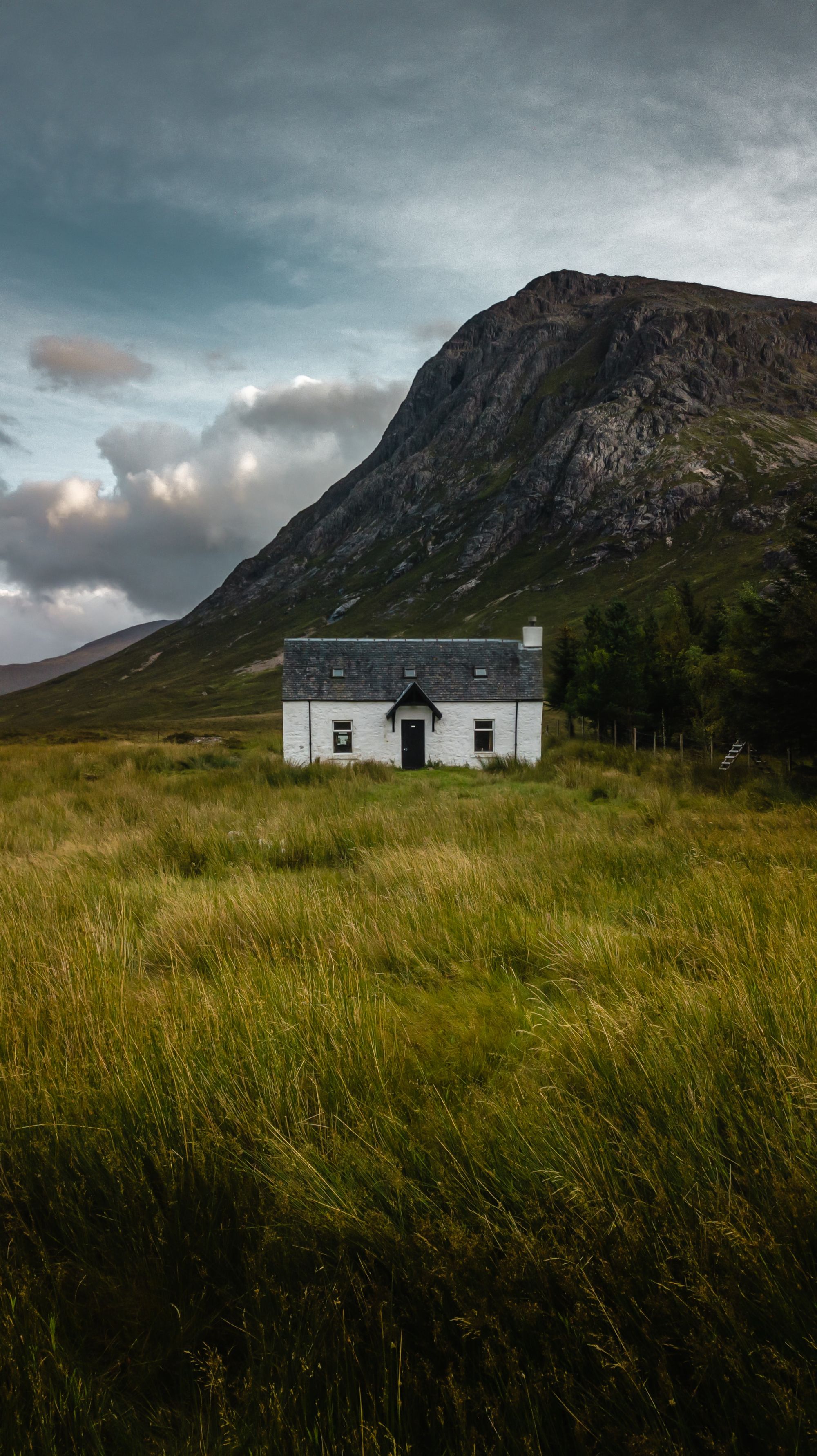
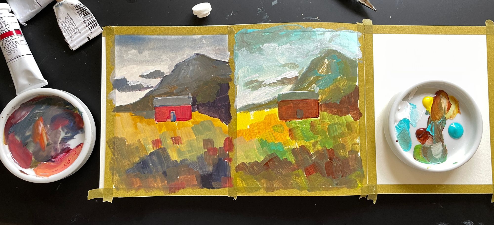
I used this reference photo to make two sketches with different triads. I decided to make the house reddish/orange/brick color instead of white so that I could show more of each palette's range.
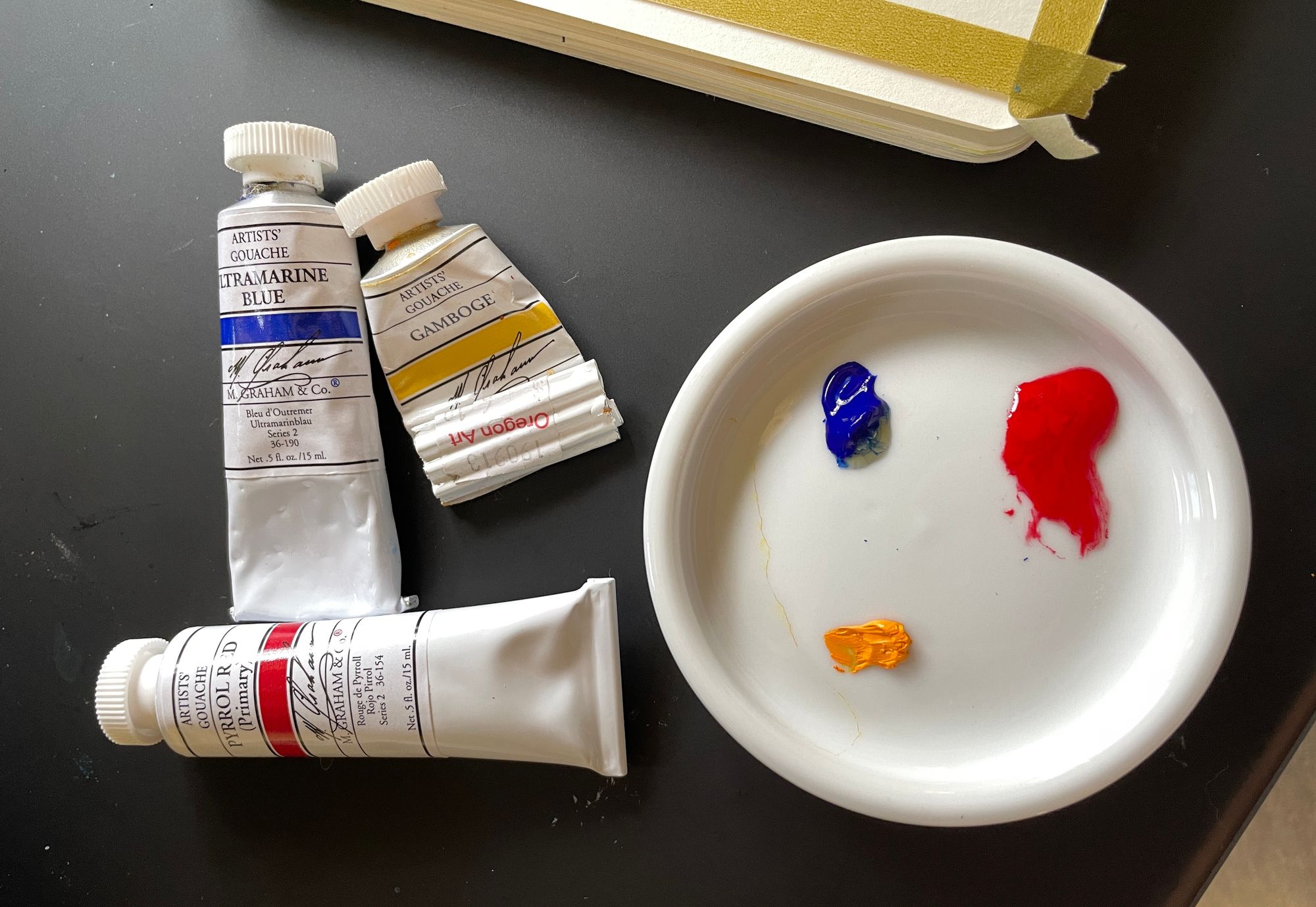
Here's my first palette. I'm using Pyrrole Red, Ultramarine Blue and Gamboge gouache.
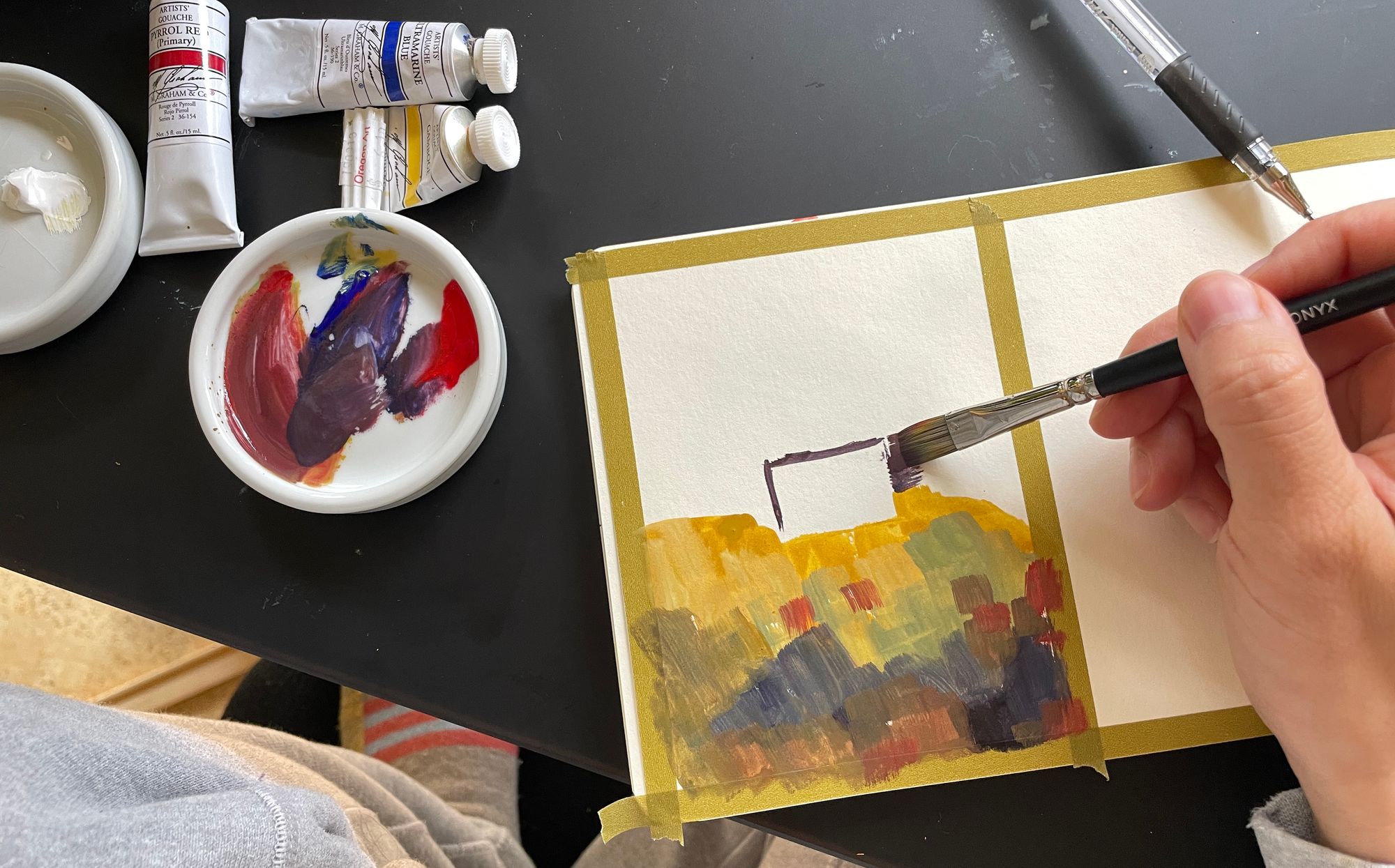
Each triad will generate a different set of mixes. This set has a yellow and red that are orangish and a blue that is purplish. According to convention, all three of these are considered warm versions of their color.
Since the yellow is orangish and the blue is purplish, it won't be possible to mix a bright green. (One way to think of it is that both the yellow and blue have some redness in them, so the green will be pulled toward neutral since red is opposite of green. More on this in this month's video lesson.) We are able to mix nice rich yellow and ochres and darker, purplish colors.
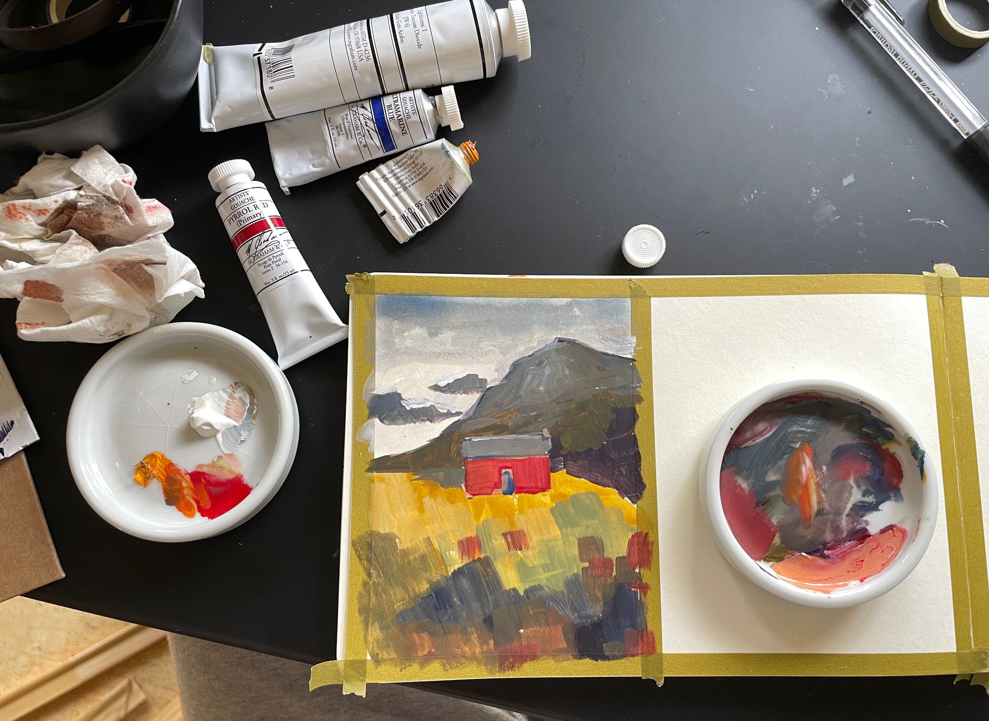
Just about any set of three primaries will be able to mix a fairly neutral gray, if we balance the mix just right. Figuring out how much of each color is needed is discovered through trying out mixes and shifting the color closer closer to gray. You can compare the grays I found toward the front of the mountain in each example.
Here's the second version, where I'm using teal, benzimidazolone yellow medium and burnt sienna. Teal is a very cool (greenish) blue and burnt sienna is a desaturated (brownish/grayish) red. The yellow is a fairly neutral yellow, but it is cooler (greener, or, less orangish) than the yellow I used in the first sketch.

Neither of these sketches have the same colors as the reference photo at all, but both of them make sense in their own way, and also include a lot of key information from the reference.
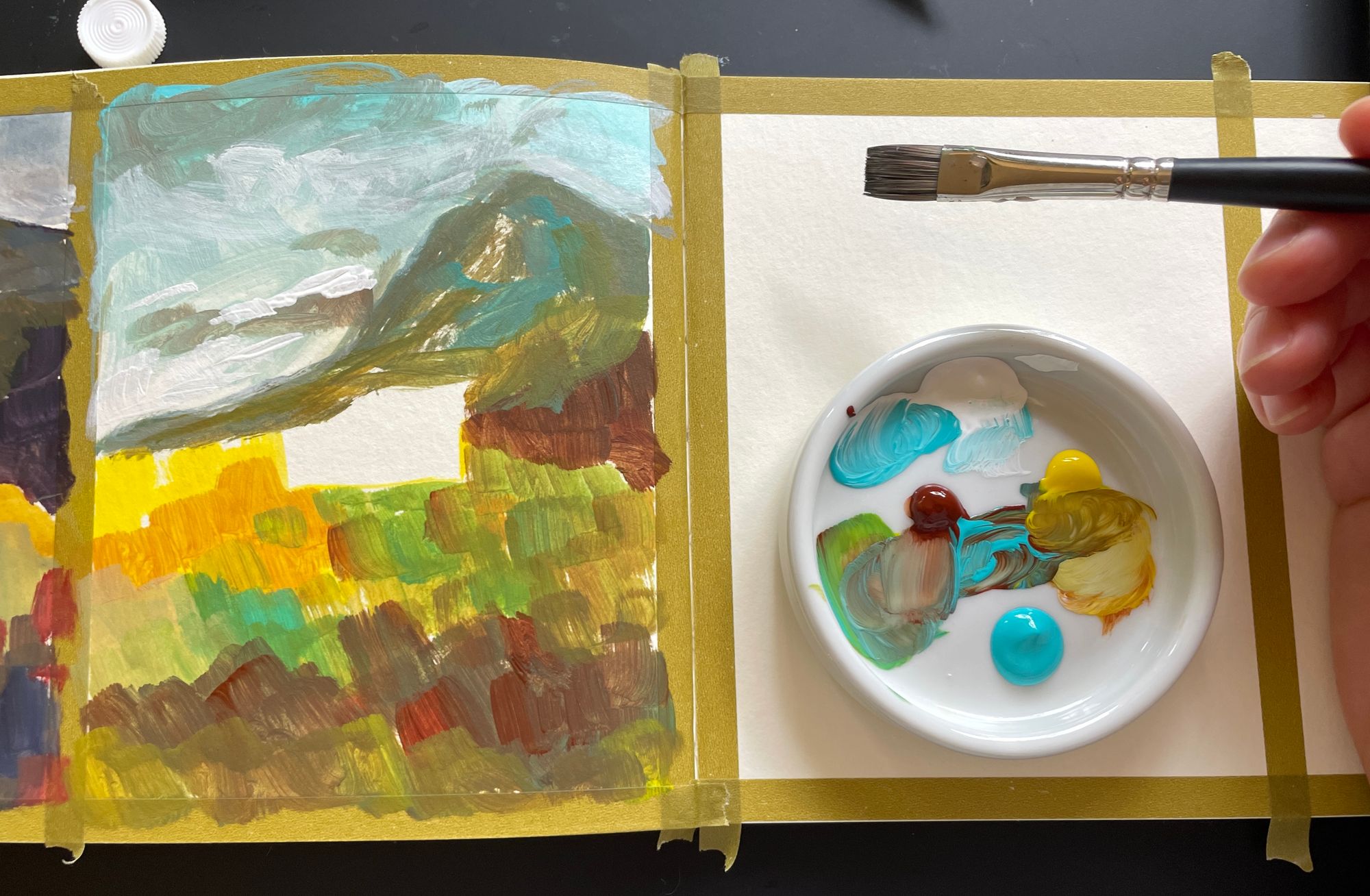
In each, I looked for the areas that are the yellow-est, darkest, greenest, etc., and then find those relative colors in the palette I'm working with. Here are some of the color points I see in the photo: