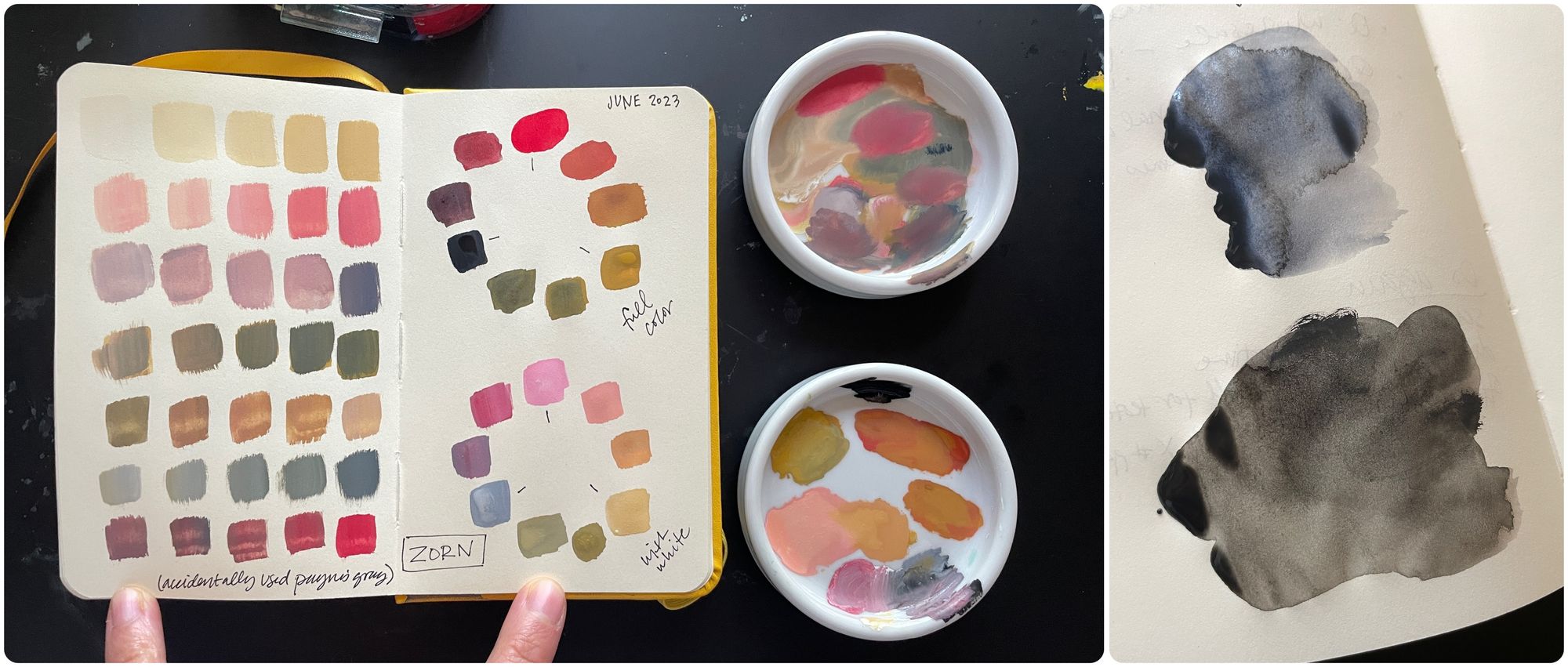
Zorn Palette

In this month's main post I introduced one of my favorite limited palettes: the Zorn Palette, which is made of a bright warm red (often cadmium red, but I'm using pyrrol red here), yellow ochre and black. You can click here if you want to read a bit on its history, because we're going to jump right in.
I love that this palette gives us huge range with tons of luscious neutrals. Since the yellow is earthy and the "blue" is subbed out for black, we avoid the bright mixes and get a broad set of grounded shades that are perfect for painting people. If you have trouble mixing skin tones, I'd recommend starting out with this palette to get some practice and then branch out from there.