Value, Part 2

Welcome to Part 2! Let's continue to play with value. Here are some ways to get started:
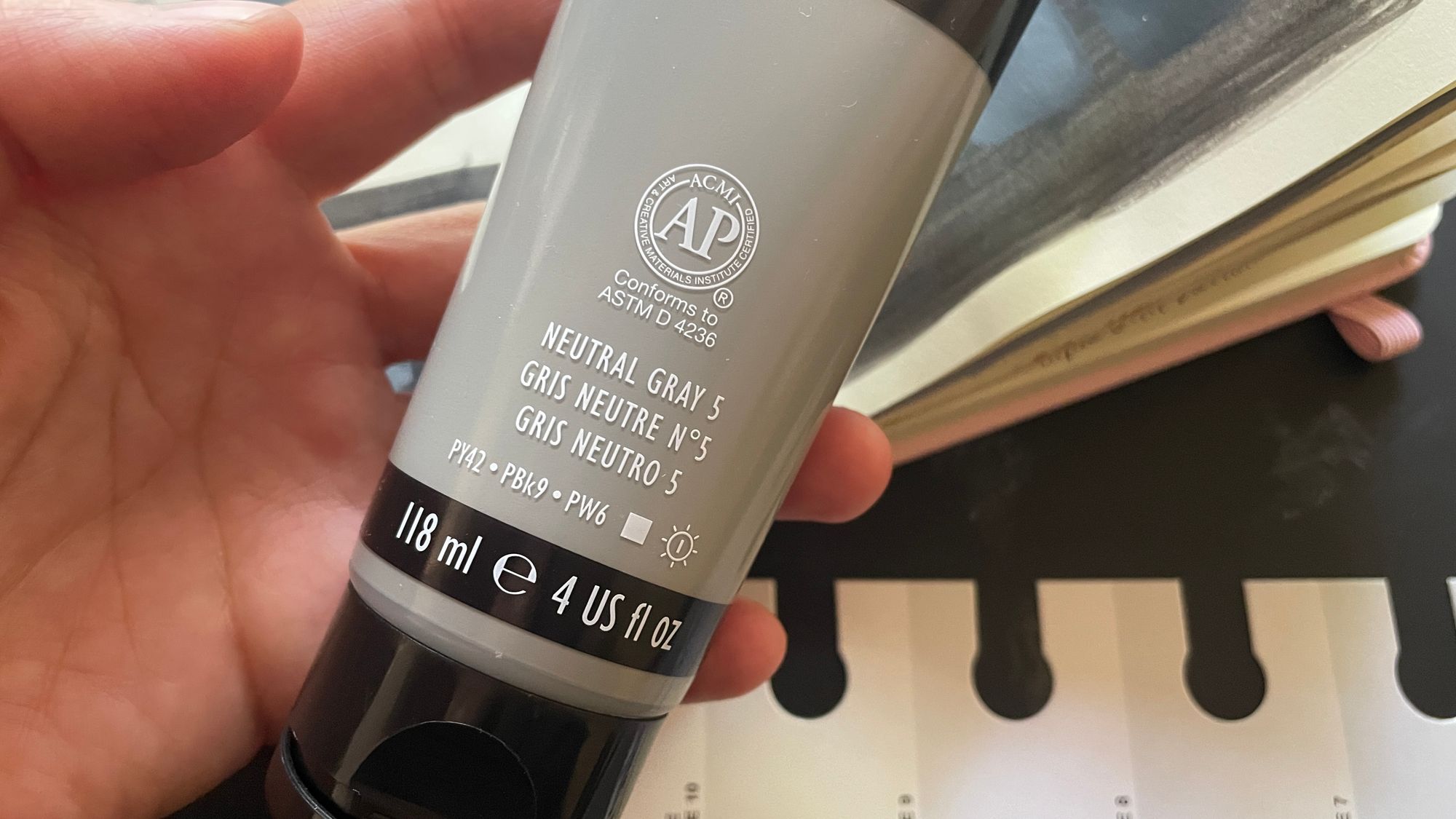
Getting it right: actual gray 5!
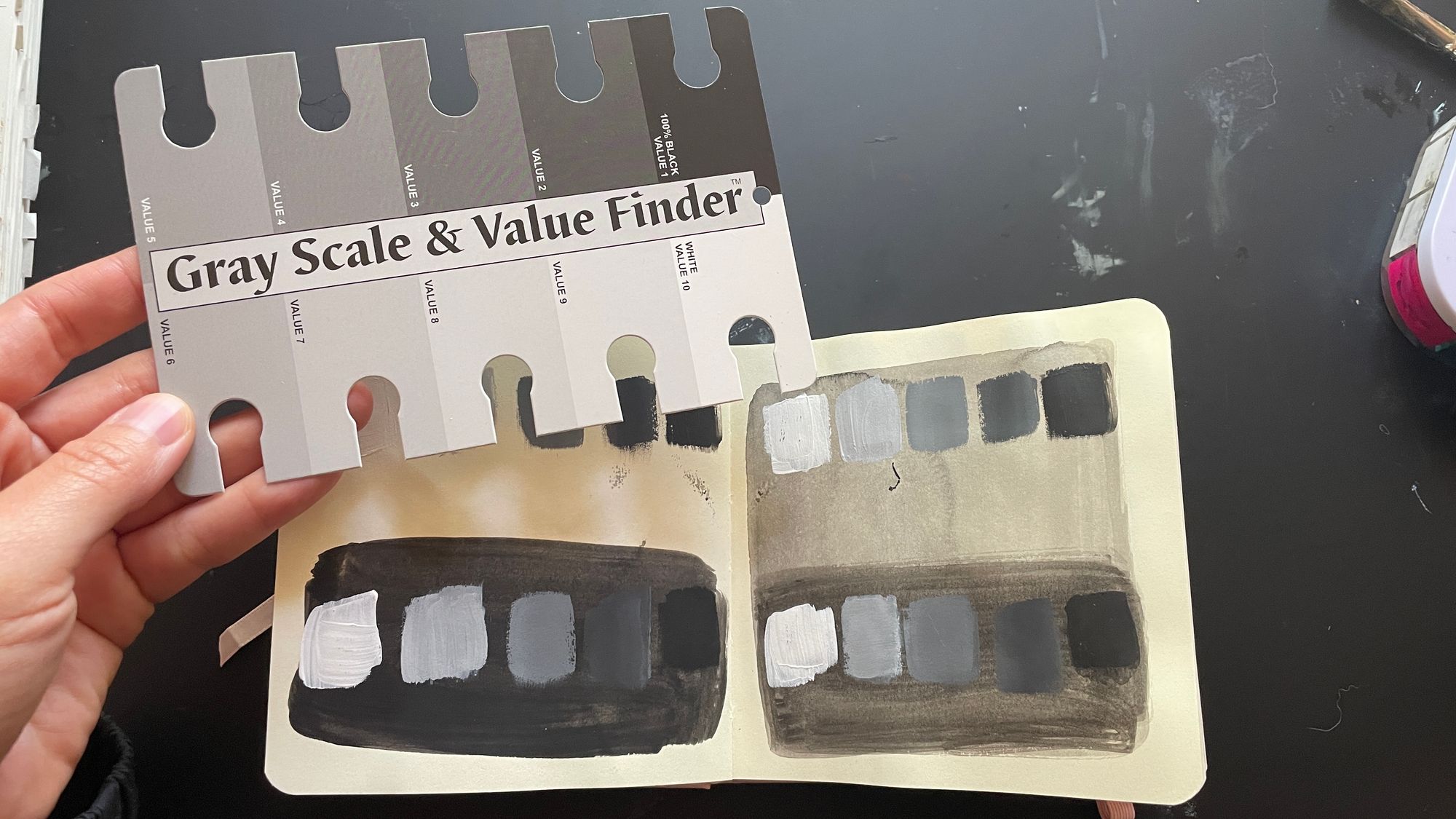
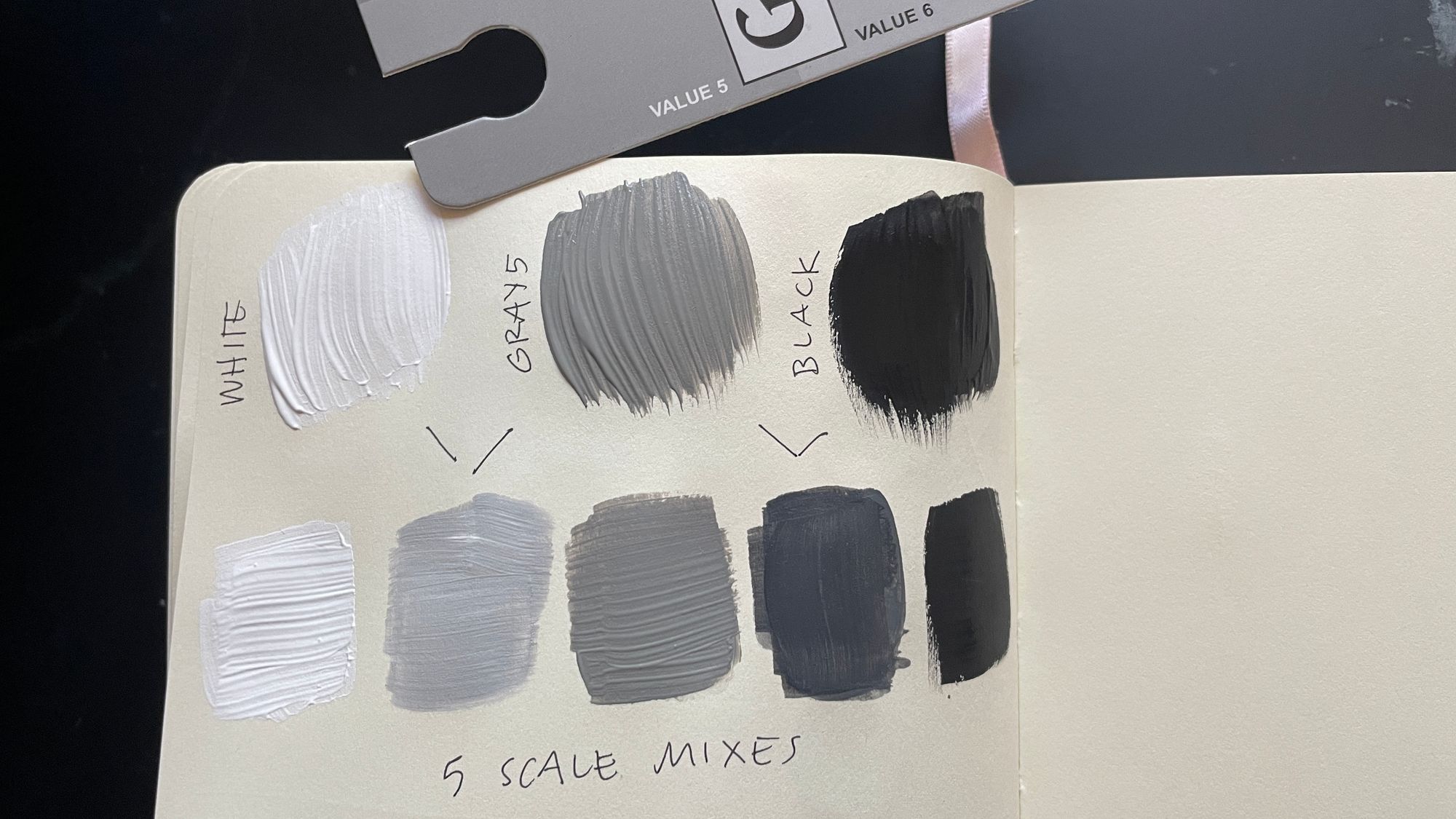
I tend to mix my middle gray chart darker than it should be. When we look back at this month's first post you can see that I leaned too heavily into the blacks for my intermediate mixes. One way to know for sure where a value lands is to use a value finder. I picked this one up at my local art store for $3. Here's how it compares to the scales I made by eye.
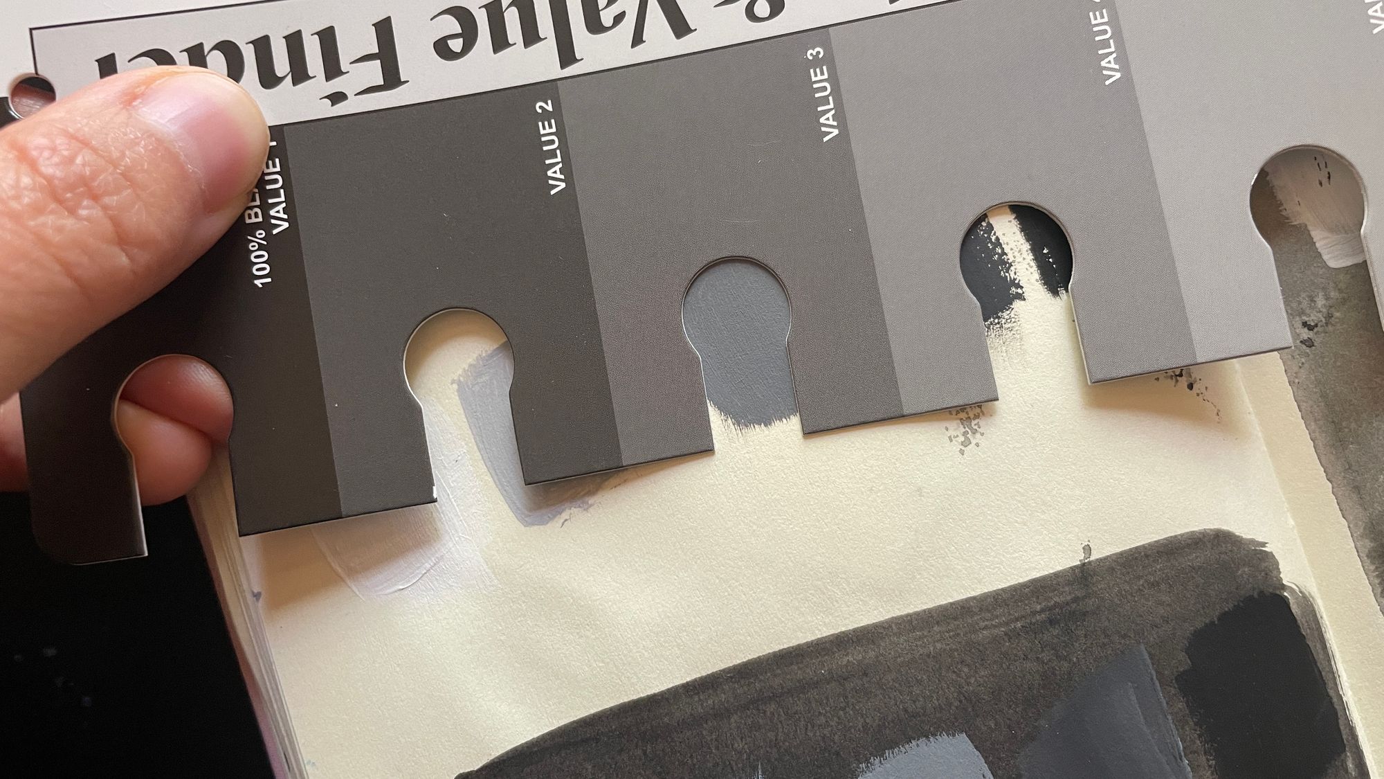
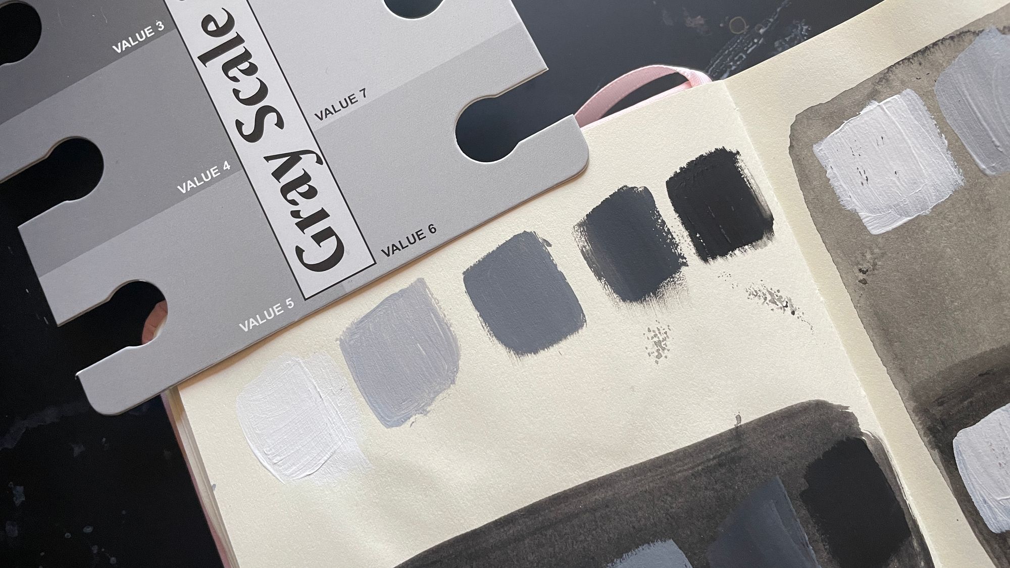
You can actually buy Gray 5 (the 5th value on a 10 step value scale- so it's slightly darker than the midpoint between white and black) which I did!
If you have gray 5 you can use it to estimate that middle value, and then make mixes with white and black to get a nice, even range.
Monochromatic sketches
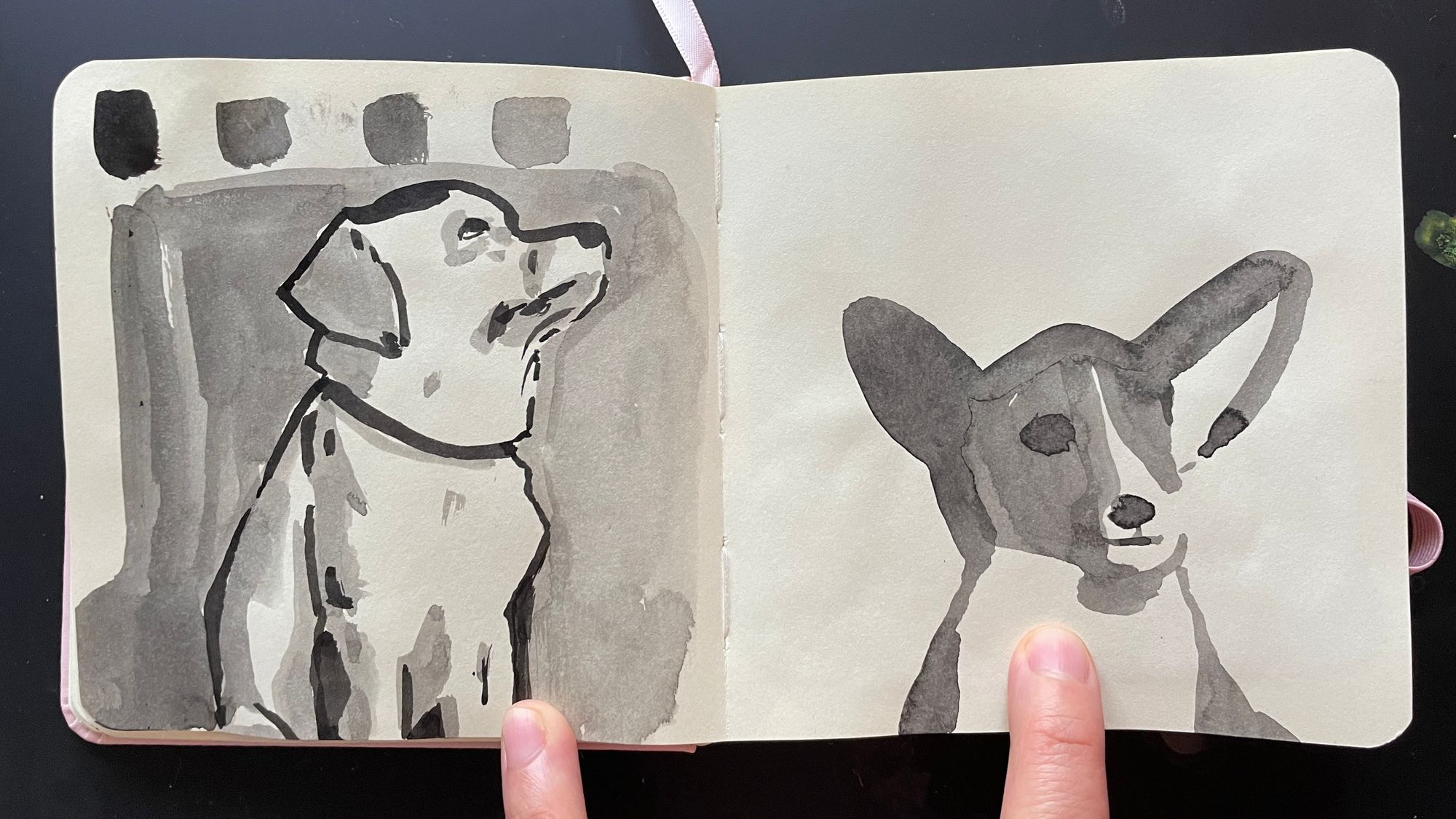
You can begin to explore value based sketches without getting too concerned with perfect accuracy. Often, just getting it into lighter, darker and middle categories is plenty. Here I made a couple of dog sketches using back ink, diluting it a bit with water. Even though both images have no color, and are rendered in very simplified value scales, the ideas come across.
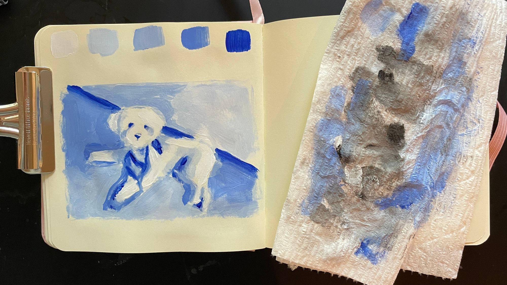
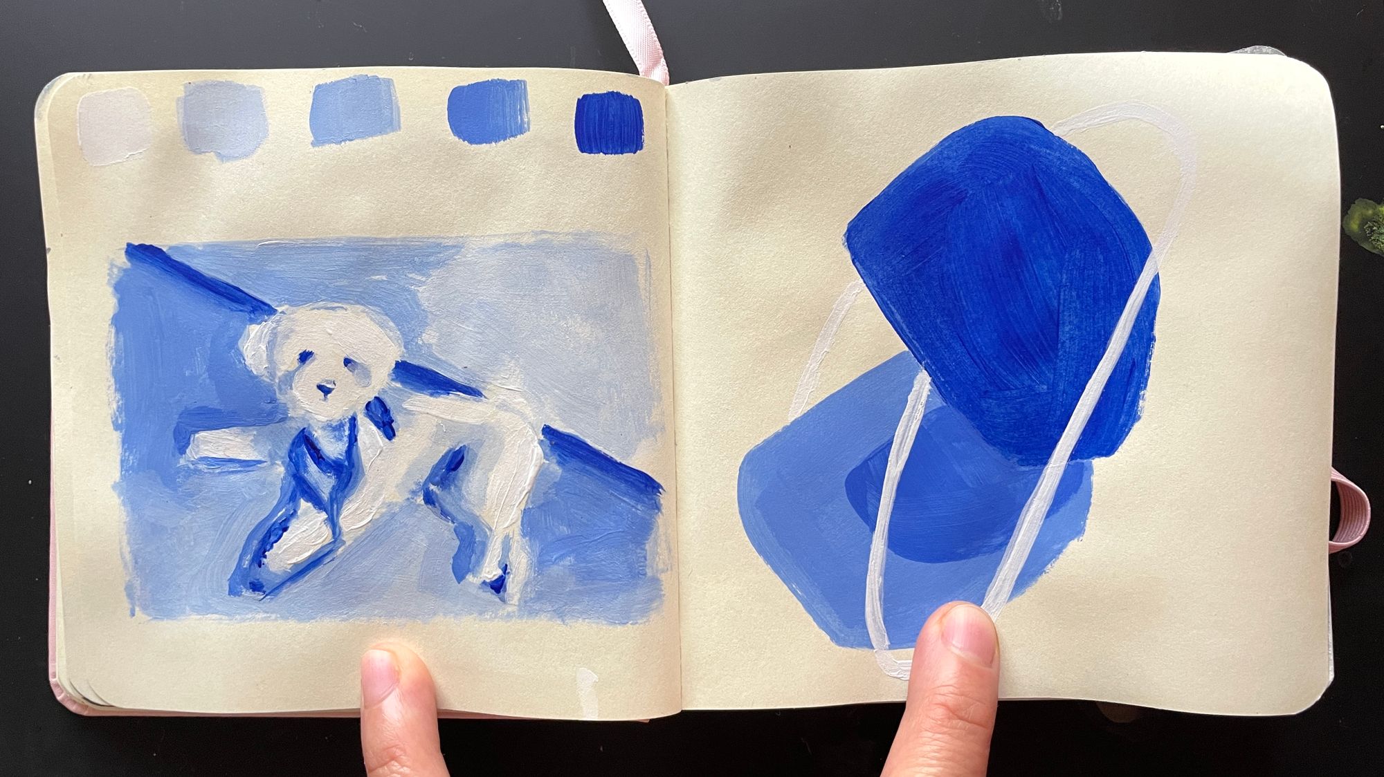
I also like to swap out the black paint sometimes for another dark color. In the image below, I am working with ultramarine blue and white acrylic paint. Doing monochromatic paintings is a great way to explore value, and they are easy to go for on the road. You just need one paint or colored pencil and you're set.
Ways to make it easier