September 2025: A Core Set of Colors

Hello! I've missed you. After a long summer of health problems, hospitalizations, surgery and complications, I'm very grateful to be back in my studio a bit, uncapping my favorite colors and cracking open my sketchbooks.
Over the past few weeks we've gone through and refunded everyone for two months (July and August). In June, I posted the regular lessons but our live class was cancelled, so our September class will be extended as a make-up class. I just finished refunding everyone yesterday, so keep an eye out and if you haven't seen yours come through in the next 10 business days, let me know. Thank you so much for your patience.
I cannot wait to paint together. Our next live class will be as planned: Saturday, September 20 at 12pm PST.
- Since we also missed our class in June, I will extend this class as a make-up for June. I plan to stay on until 1:45 or 2.
- We will be combining the color work from this month's theme with the sketching practice I taught back in June.
- I hope you're able to come paint with us. For access, make sure you're on the Light Tier, and then just follow the Google Meet link here on the day of class. I'm excited to see you!
The most urgent idea: just a few colors
Since early June, I've been sick, in and out of the hospital with a surgery and a long string of complications. I've been thinking about pain meds and blood pressure and keeping down food and emptying drains and taking antibiotics. I stopped thinking about art.
The first time I went into the hospital I brought my little pouch of art supplies with me (my "go bag") but never touched them. I had been painting the day before, but it was interrupted by going to lie down because I wasn't feeling well, and then that night we rushed to the ED. When I finally stopped back by my art desk a couple of months later, my partly opened jars of paint had shrunken and dried, my brushes rock hard with acrylic paint. I threw it all away.
I did not have any big epiphanies during this time – I mostly slept – except that I found I was naturally seeing the world with a new perspective: it all seemed so loud and busy. I had slowed down to a pace I've never before felt as an adult. Scrolling on my phone felt like being in a crowded bar of strangers, everyone yelling over each other, horrible. Instead, watching the leaves sway out the window was right at my speed. In a distant way I thought about how I'd often wanted to be someone who doesn't check my phone, whose attention can be held by trees, who can read books and not be busy. I had the thought that as hard as this summer was, there might be a gift here I can carry out with me if I scrounge around and look for it. A lower gear that I could access, perhaps.
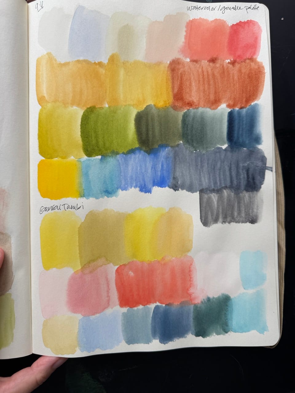
When I finally started thinking about art again, the most urgent idea I had was that I had to narrow things down to just a few colors. As my energy had improved I'd begun to watch artists sketching in their videos online, and kept coming back to posts about color. I loved it when their palettes were very simple. I was captivated by the idea of having a small range of tones and sticking to them – not mixing other shades in between that much, just using the paints as they were. (I've played around with this idea before, but this time around I was particularly motivated by TJ Marston's demo on her 'master palette').
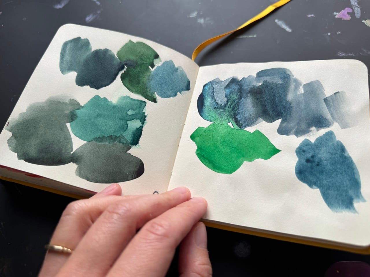
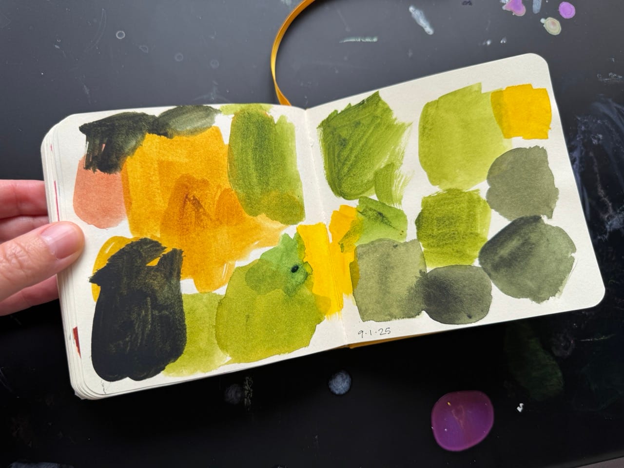
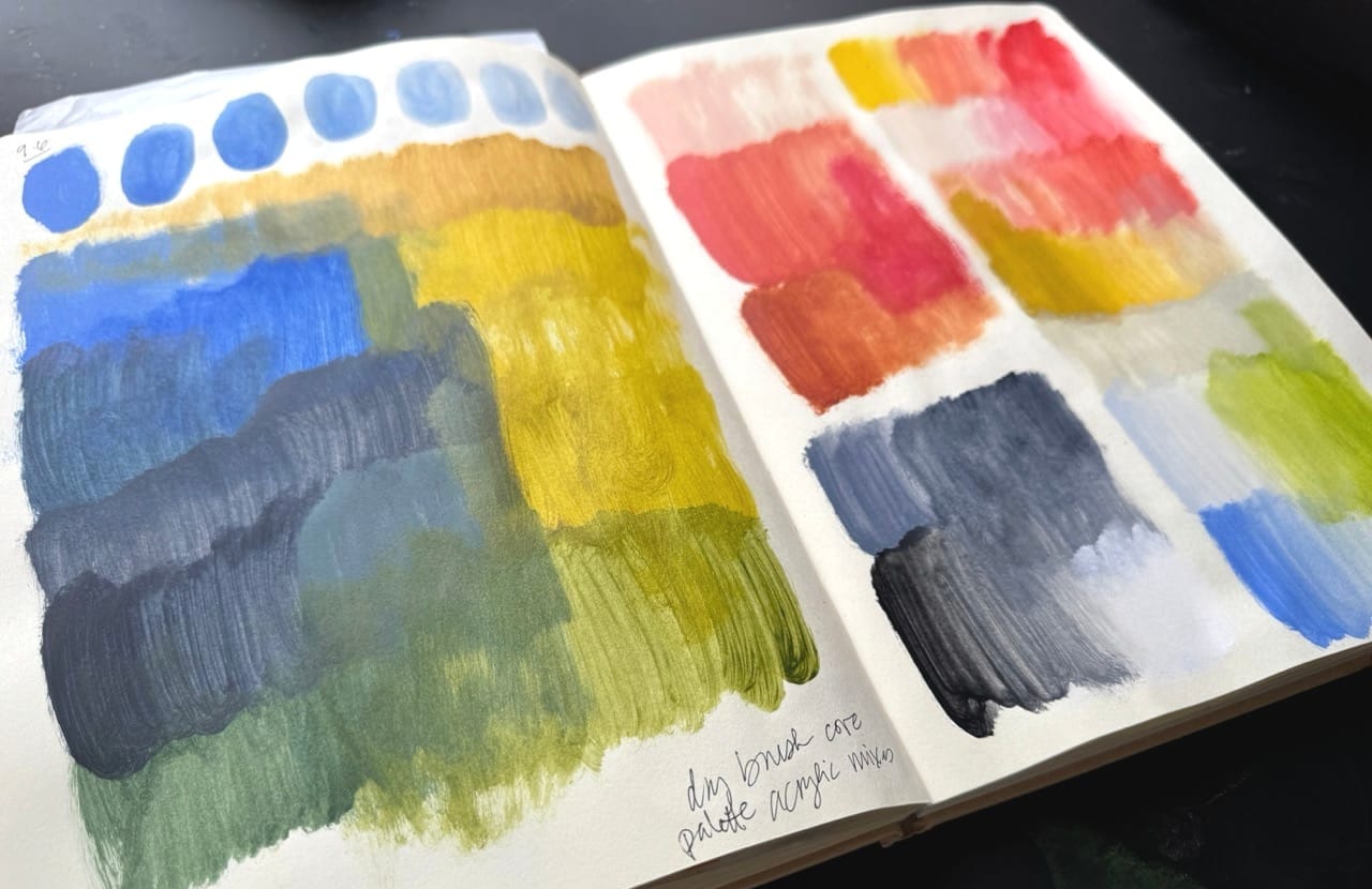
Finding colors
🎥 Note: The video timelapse showing the process of building out and swatching this palette in various mediums is included at the end of this section.

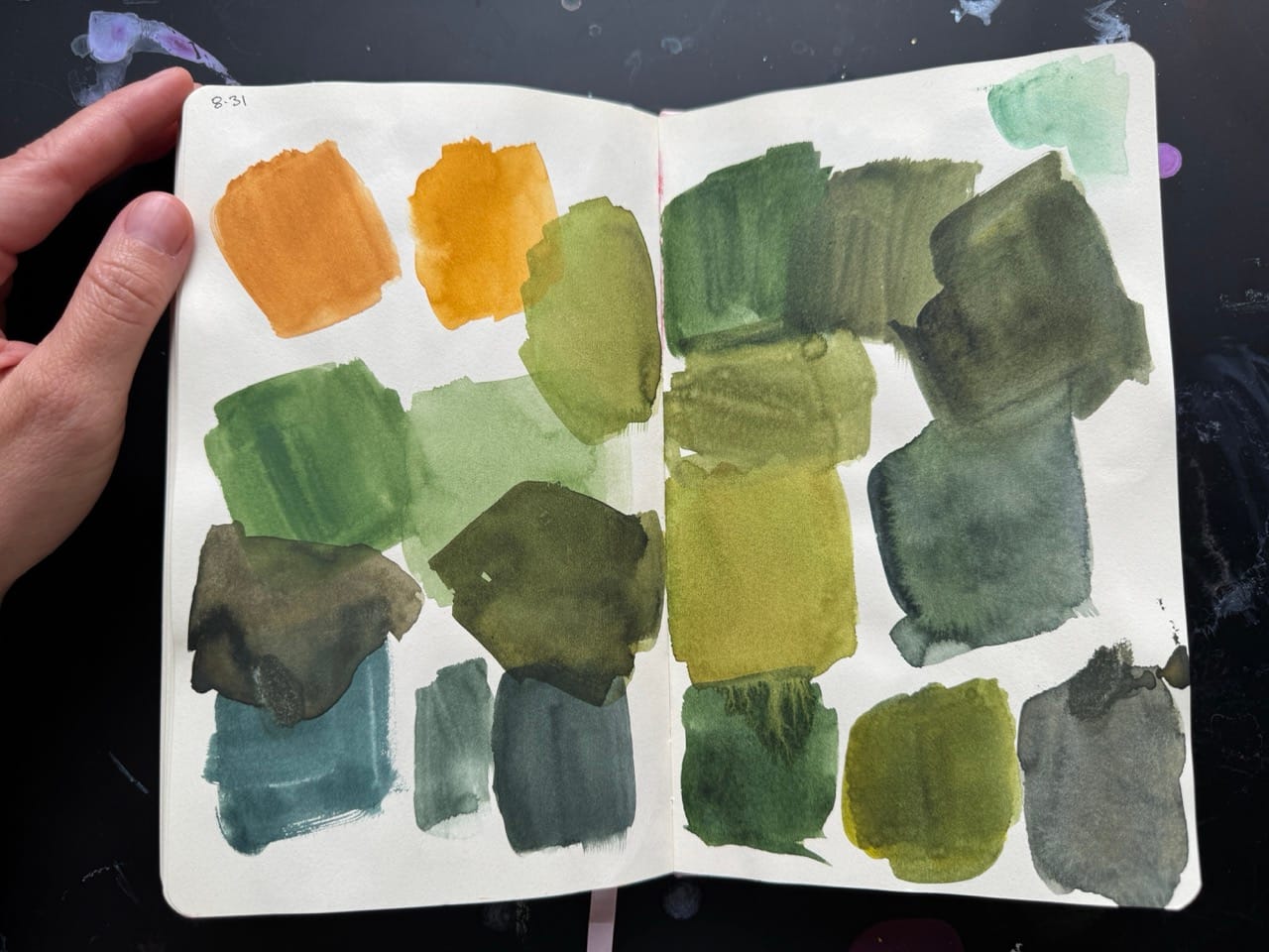
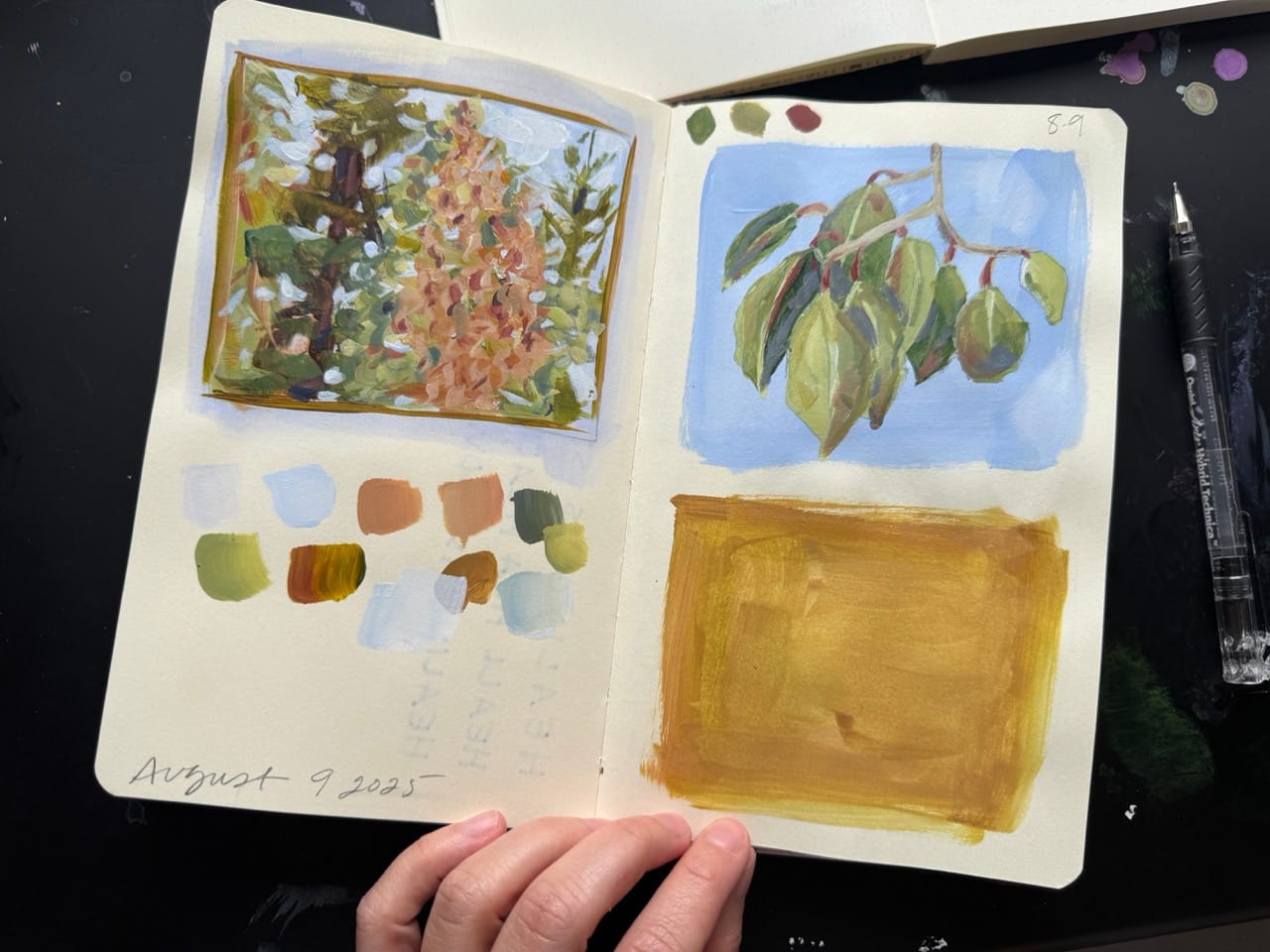
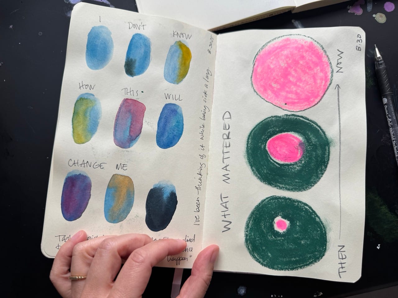
It was the last couple days of August that I started to feel well enough to come sit at my art desk a bit each day. Below is the first thing I sketched – two rough abstract diagram ideas, pairing some phrases that had been on my mind with shapes. I grabbed colors that were close at hand, stuff I hadn't put away back in June. I remember thinking that there was a discordance to the colors, and it bothered me enough that I determined I would narrow down my palette before I sketched anything else. Usually this kind of thing wouldn't bother me, but I felt different, I needed a harmonious, easy palette, or I had the sense I would just go back to bed. Besides, swatching color always feels welcoming, and easy way to begin again.
So, I started with what I knew: I wanted a deep green, one that was earthy and rich and warm.