
May 2025: In every mood

I am coming out a stretch of time where I let my creative practice slink back from the big projects and the large canvases, back into my sketchbook, to painting things just because. I can only focus on art with some kind of seriousness for so long. There are other parts of me that need a turn with the crayon. In fact, this is key to prioritizing art in my life: I have to make sure I can access it from all kinds of moods and energy levels. I think this is one reason I am so successful (🙄) at being on my phone every day: it doesn’t require that I’m inspired or energetic or in any particular mood to engage. I try to foster a creative practice that is just as flexible. For me, art can’t be something I leave my life to do, or feel like some kind of performance that I have to be "on" or prepared for. I need to able to reach it for when I’m feeling creative and inspired, and when I’m tired, when I’m bored, when I’m busy, when I’m quiet, when I’m lonely.
Art when I’m quiet:
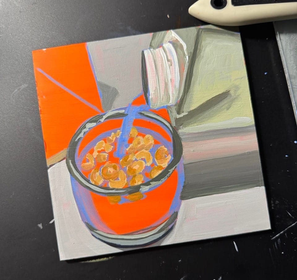
Here’s a painting I made when I had nothing to say. I opened my phone, flicked back through the last few weeks of photos and came across this one I took as joke when Danielle made the tiniest bowl of cereal. Cheerios in the tiny bowl we usually use for soy sauce.
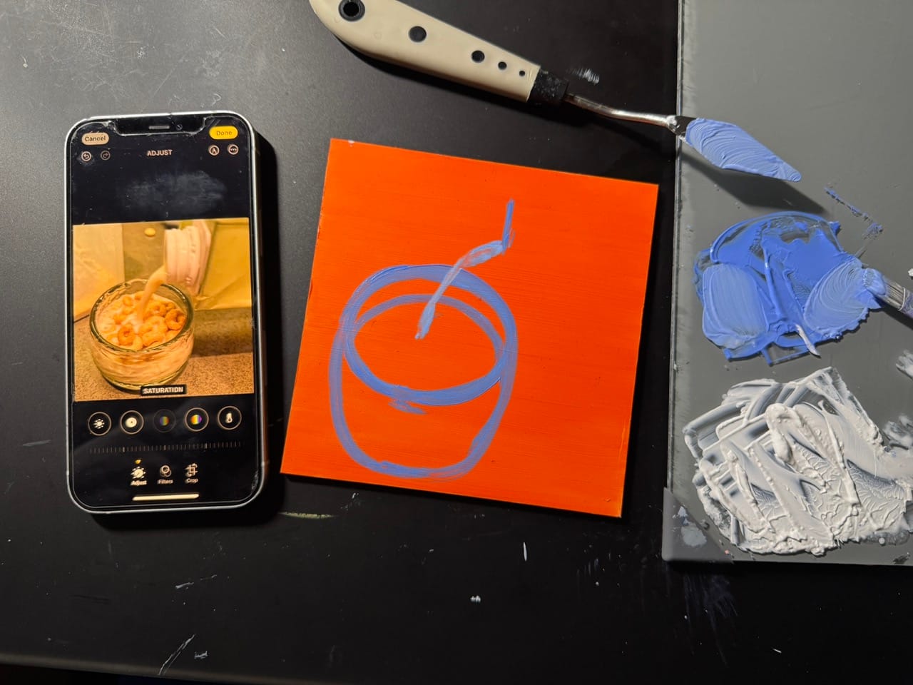
I grabbed this 4"x4" panel that was in my paint over everything pile. It was a messed up painting of some kind that I covered with leftover orange paint a while back.

I sketched with an opaque blue (this is ultramarine blue + white), which is the opposite color of bright orange (color refresher: orange and blue are complements, meaning they're opposite on the color wheel; and then the orange is highly saturated while the blue is desaturated with the white).
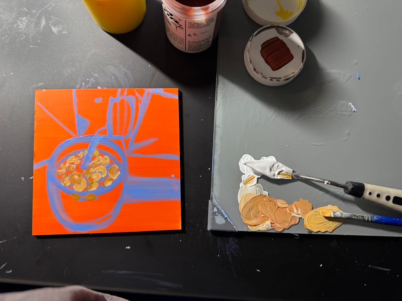
After I used the blue to mark out what goes where, I started painting in the cherrios with realistic colors mixed from white, burnt sienna and yellow.
I mixed up a dark, greenish gray to jot down the heaviest shades. In this case it was the rim of the glass and some shadow areas.

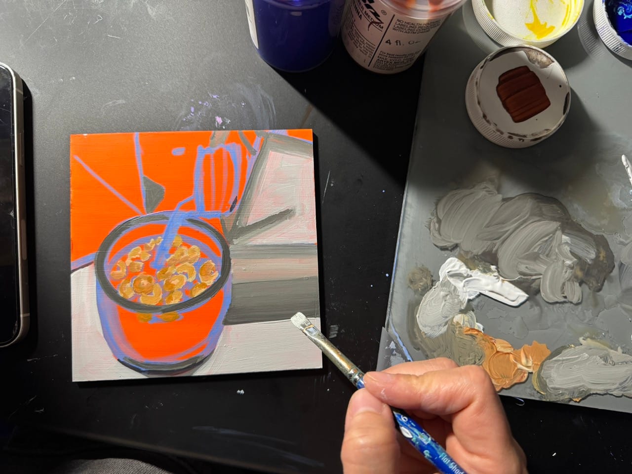
I decided to forego any packaging detail on the soy milk box and average it out to a pale greenish color.

I was painting this at night, so these photos aren't beautiful. I wanted to note that because many of us get inspired to make art on social media by gorgeously lit [read: staged] studio scenes with morning sunbeams, steaming tea, vibrant spectrums of art supplies all in the row. But real-life art looks more like this. Using up some gray paint, in a clearing where I've moved back my computer, keyboard and a stack of mail, with indoor lighting.
It's still really cute though, and fun to do.

I mixed a tad of that yellow/brown color into my white to warm it up for the milk. I resisted the temptation to make some distinction between the white of the soy milk box opening, the stream of milk and where it splashed into the bowl. Letting these different objects that are actually the same value merge together is a type of value grouping, which is powerful way to simplify a painting and make it easier for the viewer to understand.

I like letting faint bits of the orange and the blue show through, either in the cracks, or due to the partial transparency of the other layers (see the orange peeking through the white of the counter?). Exactly how much to cover up is a creative decision each time.

There's a point in every painting where your edits start to make the painting worse. I knew I was done when I hit that point here. For example, I don't think that adding the shadows on the stream of soy milk add as much as they take away. Even if it's truer to life, I miss the simplicity of the white on white on white grouping I had before.
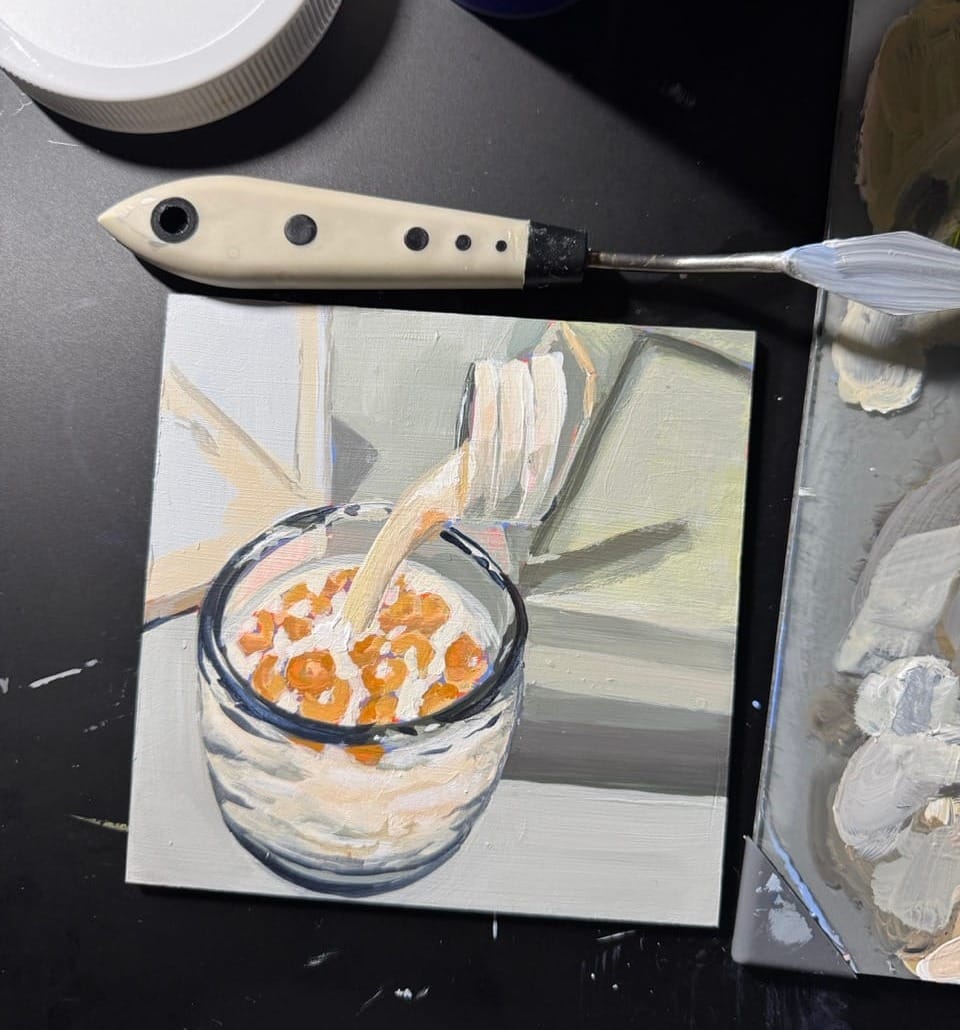
Another way to know when you're done is when it's time to go to bed. Here's where I was when that time came – the dogs needed me to let them outside, and it was getting late anyway. Call it a wrap.

Here it is all dried, out in the light of day.

I love an almost all-gray painting. It makes the bits of color really pop. This piece reminds me of another gray painting I did, back during the pandemic. It's of Luke's Diner, and the overall desaturation is in stark contrast to the white/red/yellow accents.

Art when I'm busy

Here's some sketchbooking that I did in the span of about 2 minutes. Below you can see mirrored shapes – those are acrylic paint blobs that I smooshed between the pages a few days before. This day, I had just a moment and a bit of green paint left over from a canvas painting (above) I was making for work. I was cleaning up and I wanted to use it up instead of throwing it out. I surprised myself by doing this: